Sunshine Succulents Case Study
01. Discovery
Initially, there was a lot that needed to be researched and defined. An elevated brand and interactive ecommerce prototype couldn't be produced until the target user was defined and the use case made more clear. Products needed to be segmented into logical channels so users could find what they needed easily. I started with user interviews.
USER INTERVIEWS 5 users, 3 women and 2 men from 25–75 years old, were interviewed. Participants answered important questions about the aspects of gift buying that make it a winning solution for them. They were asked specifically who they would most likely buy a gift succulent for.
INTERVIEW QUESTIONS:
- What aspects of giving a succulent make it feel special to give as a gift? (i.e. why would you be interested in giving a succulent as a gift?) Please be specific.
- If you were to receive a succulent as a gift, what would make it seem unique or special?
- Do you prefer giving a succulent gift to a recipient in-person? Or, would you rather have it delivered to them by a courier?
- Who would you buy a succulent for?
Results revealed that the majority of users who give succulents as gifts feel they are a practical choice, especially for working professionals giving to a work colleague or business associate. 100% of users interviewed said the convenience of being able to pick up or have delivered a succulent in an attractive container along with a personalized message by them would be a very appealing gifting offer.
QUALITATIVE USER FEEDBACK:
“Succulents are such a good gift choice for a work colleague or friend. They last for a long time making them much more practical than flowers. They require very little water or care. They look nice on a desk or in a home, and they serve as a reminder of the sender’s thoughtfulness.”
“Giving gifts is always a challenge for me. I rarely feel confident in what I give and fear most of my gifts get put aside/don’t get used, or are generally not needed or wanted. I like the idea of giving something that isn’t wasted and will likely be appreciated.”
“I would buy them for important friends, colleagues, bosses, or other community members.”
“If this succulent came in a tasteful but unique pot/container that I got to choose for my recipient, I think this would make a very nice gift for a friend or co-worker.”
02. Define
TARGET USER The analysis of data from Google Analytics combined with the qualitative feedback from user interviews defined audience rankings in order of focus:
1 – working professionals with little time/desire for gift hunting/wrapping (females and males, ages 30-65)
2 – health-conscious yoga moms (females, ages 35-50)
3 – environmentally minded millennials (females and males, ages 25-43)
4 – retired individuals with extra income to spend on luxury items like jewelry, plants, fine dining, etc. (females and males, ages 65-75).
KEY TAKEAWAY
Target users believe in the practicality, longevity, and beauty of succulents for themselves and giving them as gifts appeals to their own sense of style and self-expression.
PRODUCT SEGMENTS Now that the users were better understood, it was time to define the products. Current high-value returns were reviewed, as well as low-performing products, and the greatest strengths and opportunities were considered. Key product segments were formed. Gift Shop, Corporate Gifts, Environments & Wall Art, and Gifts for the Home became the product positioning strategy for the next phase of the project. Within these four main categories, products were grouped into more specific subcategories with a key focus on visibility within the website’s hierarchy and interaction flow.
03. Ideate
LOGO, BRAND, STYLE GUIDE With the users and product strategy guiding the way, a newly positioned brand was created to elevate products for high conversion on the web and increased awareness at point-of-sale stores. A logo, color palette, and style guide were created to reflect a new, modern brand identity, focused on clean lines, simplicity of style, and a color palette incorporating light greens and greys and the strategic use of black for maximizing impact where intended. The aim was to evoke feelings of peace and tranquility, and to connect those feelings to a professionally minded, environmentally focused demographic, bearing in mind that the primary user will purchase these succulents as gifts for work colleagues and friends within a professional context.
The logo and site typography were chosen to reflect a clean, geometric, sans-serif style. Brandon Grotesque was used for the logo, and Futura was selected for site text for enhanced readability and accessibility.
The Sunshine Succulents Brand Style Guide documented important usage criteria for those using the logo, featuring text, or using imagery or brand colors. Specific guidance for all print and digital brand communications was provided within the document.
WIREFRAMES Wireframes provided answers to where all interactive elements would live within the design. As a skeleton, I started with Home, Category page, Product page, Cart Summary, Checkout (multi-page), and Order Confirmation. I created an initial MVP with everything from where images and text would go, to placement of CTAs, buttons, menus, and all other content.
04. UI
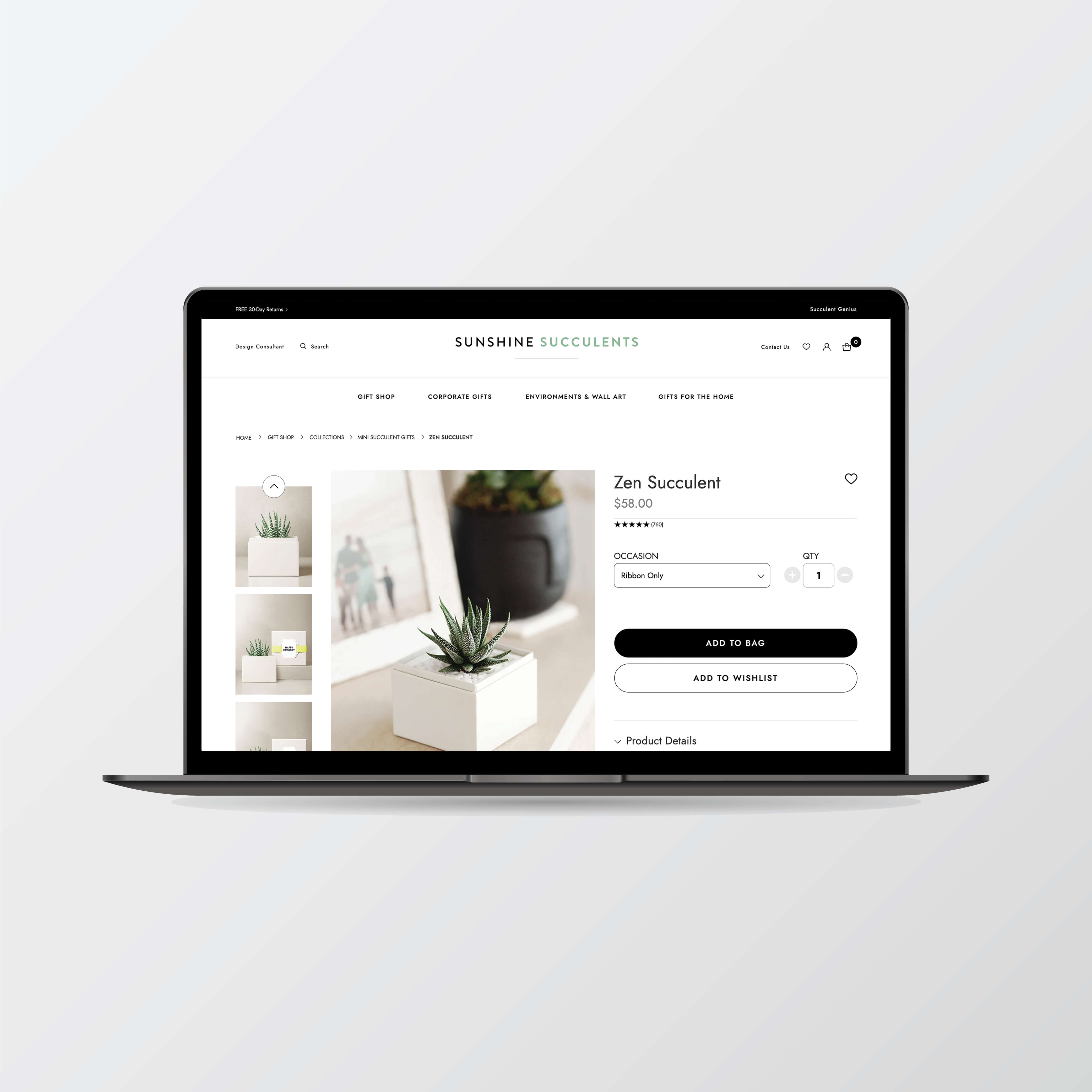
USER INTERFACE DESIGNS The Homepage Interface Design was created using the user research, content model, sitemap, persona, storyboard, and wireframe. The UI showcases a minimalist layout following the standards set forth in the style guide, with clear product imagery listed in categories, positioned on the page relative to ease of use and product positioning goals.
The site’s main navigation was positioned at the top center of the page to reduce cognitive load for users, putting to work the UX best practice for recognition not recall. Recognizable icons for User Account, Search, Shopping Bag, and Social were all implemented and placed to align with best practices for site hierarchy and recognition as well. I used a centered site layout to keep in step with the design informed by the logo. Site imagery was chosen to compliment brand colors and align with the brand’s minimalist design.
INTERACTIONS AND USER FLOW I created interactions in stages and the design underwent a handful of iterations. I discovered there was confusion on secondary screens. Users were having trouble getting to the next step (i.e., choosing by category, holiday, product type), so layout of these pages was reiterated. I added another interaction and the result produced a clearer, easier path for users to find what they needed.
The homepage of the interactive prototype features an animated carousel on page load. The cycle of images and calls to action (CTAs) highlight specific yearlong and seasonal/promotional product offerings. Product features map directly to results of the user research. User flow throughout the checkout process was the most critical aspect of the design’s flow. It needed to be easy, intuitive, and custom. After a user selected a succulent product, they needed to be able to easily choose a container, select packaging options, write a brief personal message to the recipient, and decide whether to pick up their gift at a specific shop or have it delivered.
05. VALIDATE
SUMMARY OF USABILITY TESTING I used the DECIDE framework to determine the goals, explore the questions, choose the evaluation approach and methods, identify the practical issues, decide about ethical issues, and to evaluate, interpret and present the data.
Using this framework, I was able to test five users from each demographic within the target market. I conducted tests in the field at a user’s home, in a small office space, and in a cafe to best replicate the natural environment users might be in when deciding to purchase a gift succulent (i.e., home, work, out).
RESULTS OF USABILITY TESTING Data from the study suggested that an easy return policy where users were very likely to see it would increase confidence in purchasing on the website. The study also revealed that dropdown menus under the main navigation(on click or on hover) might help users find key areas of content by category more easily. In addition, a Shop All button was suggested to help lead users to product more clearly and efficiently. Many users reported a desire to be able to ship products at different speeds (2-3 day or expedited shipping) and would also like to be able to pick up in store at one of the three local shops. Users also reported that buttons to print, edit, or cancel order would all be helpful on the confirmation page.
IMPROVEMENTS MADE BASED ON USABILITY TESTING Users provided very valuable feedback and each of the suggested improvements were made to the prototype. This includes the free 30-day return policy which was added to the promotional banner above the logo sitewide. A Shop All Gifts button was added to 4 out of 5 rotating carousel images in the hero section of the homepage, as well as just below the three main product category images directly below the fold on the homepage. Additional shipping speeds were added as options to the checkout page as well as the option to pick up in store at one of three locations. The free shipping holiday promotion was added to the cart summary page. Buttons to print, edit or cancel order were all added to the confirmation page. Lastly, mouseover dropdown lists were added to the main navigation for all pages of the site.
Outcome
This project emphasizes the importance of gaining valuable user feedback for an easy, usable ecommerce checkout journey. The user feedback resulting from user evaluations proves critical to the process of designing for the easiest, most efficient, and most enjoyable user experience.
Lessons Learned
I learned a few new prototyping skills designing this project. One was for the user’s checkout process. Using the UX design technique, progressive disclosure, I kept additional features and information hidden until selected by users. For example, ‘Ship Options’ during Checkout only appear when radio button is selected. Otherwise, if the user selects ‘Pick Up In Store’ then the list of locations/store pick up addresses and selections are offered. The reverse scenario applies too: if a user selects ‘Ship Options’, the user is presented with only shipping speed options, and not ‘Pick Up In Store’ options. This conceals unnecessary information, offering only what’s relevant to the user. This reduces clutter and cognitive load making the path to order completion easier, faster, and simpler.
UI HANDOFF KIT An easy to understand UI kit was created for future team members to use as a reference to Sunshine Succulents’ User Interface elements.