Jones Art Studio Case Study
01. Discovery
THE PREVIOUS SITE (The 'Before') The client had a previous website but when the domain name was loaded into browsers, a worrisome error message appeared stating the site wasn’t secure. This impacted site page views dramatically. Google Analytics revealed most users bounced upon entrance to the site as a result.
Also, the site domain was jonesartstudios.com (plural) but the client’s email address was listed as jonesartstudio.com (singular). Many users reported having difficulty finding the client’s website due to a domain-email mismatch. The website had been built 11 years prior, in 2014.
The homepage featured bios on each of the artists but didn’t offer works for users to peruse or interact with. Within page galleries, users were presented with thumbnail images of paintings that could be enlarged, but to continue viewing images, users needed to close and open each image individually. The contact form wasn’t functional, and the website wasn’t responsive. A user viewing on mobile wouldn’t be able to experience the site.
There were a lot of great opportunities with this project.
UNDERSTANDING Initially, I needed to understand the users better. The client had in mind a user profile that seemed limited. I tested assumptions by creating a user questionnaire that would reveal answers about who this product might appeal to. I needed facts about what the users would find engaging and useful. And I needed to understand more about the user mix: male/female ratios and respective level of interest, age, relative web usage and digital savviness, career-focused vs retired individuals.
Another key goal was knowing what information on an artist’s site would be most useful. The prior site didn’t feature the subject’s name on portraits, for example, or the painting name below a landscape, still life or figurative painting. As a result, users might not know who or what they were viewing a painting of. We asked users whether including painting names and other information would give context to paintings and whether this was useful.
QUESTIONNAIRE 10 users, 5 current and 5 prospective, between the ages of 35-80 years old, were sent a questionnaire form following a phone call asking them to complete it. Participants answered important questions about specifically what information about a painting they would find most useful. We also asked them about themselves (how often they use the web, level of education, age, and other demographic information) so we would have a clearer user profile to work from and knowledge about how they might interact with a product like this. The information received was extremely useful.
Results revealed that this product is most valued by users between the ages of 55-80. Many of these users are working in a reduced/scaled-back capacity (i.e., not full time), their education level is graduate-level and above, they use websites at least a few times per day, with most of their web usage occurring on mobile. Additionally, most users reported a desire to know what they’re looking at on an artist’s website (i.e., name of the painting, who it is, where it is, or what it is).
QUALITATIVE USER FEEDBACK
“I would first view paintings on my phone. If I was interested enough in the artist’s work, I might pull it up on my desktop, but if the mobile experience wasn’t good, I don’t think I would look at it on other devices.”
“I would find it very useful to see the artist’s name of the painting and the size. The name might give me information about what/who it’s a painting of, and seeing dimensions would help me understand how large/small the artist’s paintings range.”
“I would be most interested in seeing the art as early in the mobile experience as possible. If I don’t find what I think I’m supposed to find quickly, especially when I’m on my phone, I typically move on to different things quickly.”
“I might be more interested in looking at an artist’s work when I’m older and I have more money to spend on something like this.”
“I prefer modern art for my home so I may not be interested in artwork from this artist. I might take a quick look on my mobile if it’s easy to navigate, though. I would want to know the name of the painting for context.”
02. Define
TARGET USER We used the results of the questionnaire to inform decisions about who our target users are and what to include within the site. This is the target user matrix in order of focus:
1 – partially retired professionals, those who still have professional networks and are senior members of companies, may have established legacies (males, females, ages 50-65)
2 – retired professionals interested in nostalgia of art in their homes (males, females, ages 65-80)
3 – influencers, not interested in purchasing art themselves but might encourage others to have a look (males, females, ages35-50)
PROBLEM DEFINITION Out of many issues identified, 4 stood out as clear problems for users and the business:
- Frustrating user experience - Each gallery was designed to offer pages of images that all needed to be enlarged one by one to be viewed (Portraiture, Landscapes, Still Life, Figurative).
- Small photos - Poorly displayed images on desktop meant images in different sizes and orientations occupied different amounts of space per row creating large blank spaces on pages. Difficulty viewing painting details without enlarging each image individually.
- No mobile experience - Inability to view site or any images on mobile.
- Domain-email mismatch - Website domain different than email address causing confusion for users interested in accessing the site.
USER PROBLEM For people browsing the site on desktop viewing paintings is a frustrating experience due to inefficient UI and small images.
BUSINESS PROBLEM For anyone trying to view images on desktop, the process is time-consuming. For those accessing the site on mobile, a responsive site doesn’t exist. This prevents the business from showcasing their work, attracting business, and selling paintings.
03. Ideate
LOGO AND BRAND I unearthed useful insights from the questionnaire and applied them during ideation of the brand overhaul. The new logo was designed to appeal to the target demographic of 55-80 year olds rendered in the serif font, Cormorant Infant, evoking a classical look to align with the artist’s style of work. A paintbrush logo was designed and rotated on its axis to exist at an angle with the wordmark, now part of a memorable, distinct logo. New brand colors were selected to highlight all work, rather than detract or compete with some of the works, offering a rich, distinguished feel. The new colors include navy, khaki, and cream. Logos were output in all file types including as an SVG for a professional, high-quality look for web.
WIREFRAMES I designed 3 mobile wireframes with varied layouts focusing on each of the art genres first. These categories—Portraiture, Landscapes, Still Life, and Figurative—would serve as interactive passages to each collection of the artist’s paintings. Since users said they wanted to see the art as quickly as possible, each of the wireframes introduced the art immediately following the hero section. The previous site featured partial bios and headshots of the artists on the homepage, without showcasing the art or providing cards or visible links to view the work. The approach on the new site showcased art first, and following, a call to action to ‘Learn More About the Artists’ or ‘Contact the Artists’.
04. UI
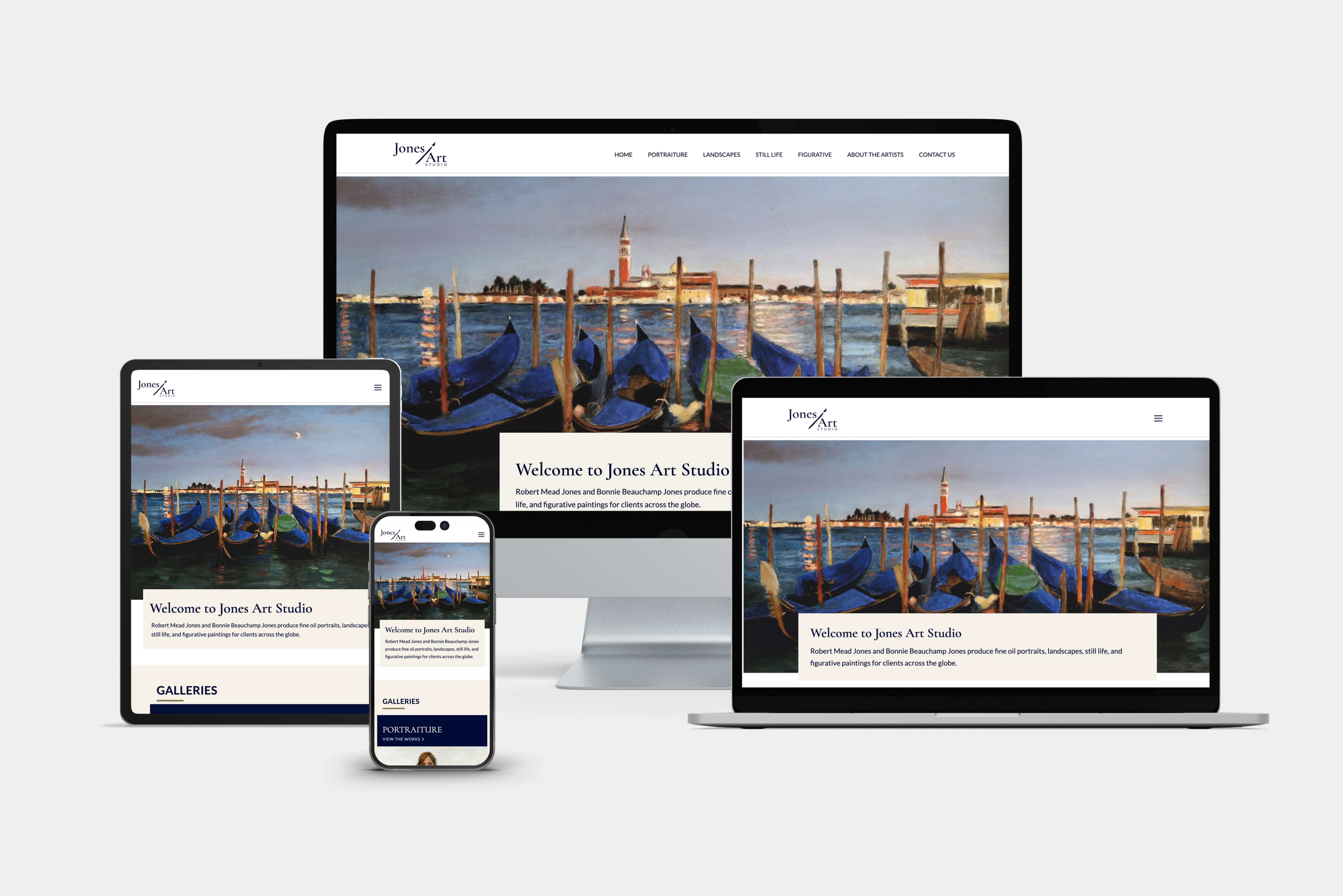
USER INTERFACE DESIGNS Using the wireframe, content model, and inventory of images, I designed the layouts for all breakpoints with the mobile experience driving all other device experiences. The new UI included large, uninterrupted image areas with smooth-swipe carousels within each gallery and easy right and left arrow buttons for viewing every painting within the site. This eliminated the need for users to enlarge and minimize images one by one, instead offering one cohesive viewing experience. I designed a persistent ‘Back to Top’ button so users on any device could easily escape a gallery at any time if desired. Labels were designed identifying each of the paintings by name and included artist name and canvas dimensions. This prevented confusion and added context to paintings for a better understanding of what they were viewing.
NAVIGATION This was simplified and designed to make sense to the user. Instead of separating works by artist, art was separated by genre, eliminating the need for additional pages dedicated to different artists. The site was streamlined to meet the needs of users and how they prefer to view the work. The final site navigation included the following 7 primary pages: Home, Portraiture, Landscapes, Still Life, Figurative, About the Artists, and Contact Us.
05. Validate
USABILITY TESTING I tested 5 target users on both the mobile and desktop experience. Tasks were given to each participant, and results were compiled and applied in two iterations.
IMPROVEMENTS MADE BASED ON USABILITY TESTING While the flow was a success from the beginning—users found it intuitive to navigate the site and complete tasks—many users said there was too much text on the Portraiture page and the About Us page. I reiterated on those pages and organized the text in staggered, two-column blocks. In certain areas I designed collapsible panels so long walls of text could be partially hidden within panels and expanded with a button as a way to keep content simple and less overwhelming.
06. Development
CODING THE SITE There was quite a bit that went into this, but for the purposes of this case study, I will keep this brief. Following user testing of the design, and client approval, I developed the site using a mobile first approach. I coded in HTML, CSS, and JavaScript and wrote media queries for 5 different breakpoints so the site would look great on all devices. I used Bootstrap for layout, mobile navigation, and form fields, JS Slick Slider for carousels, and coded all image previewing areas, the hero, all CTAs, buttons, styles, and more. The site took a few weeks to develop, and there were a few unexpected changes once I was into the work of making it function.
Outcome
The product now includes a professional, responsive website, viewable on all devices. The site currently holds 125 high quality images of the artists work, with labels identifying each painting, six easy, smooth-swiping carousels of images contained within galleries, and a functional contact form that users can submit inquiries through. Users have commented on the engaging experience of the site and of viewing images, particularly on mobile. Since this was the initial goal, this was a big win.
Lessons Learned
I learned a lot working on this project. One key discovery partway into development was figuring out many paintings were portrait orientation, others landscape orientation. This meant two viewers needed to be coded to feature the two orientations separately within respective pages. This solution was more elegant than the alternative of simply featuring different orientation paintings within the same viewer. This could have caused a somewhat disjointed, jarring user experience since image perspective would shift in size within the viewer. Nobody wanted this. So the former solution was implemented. This added unexpected development time to the project, but it was the right thing to do. I learned to pay closer attention to all assets given from the client. To note size, orientation, and the number of images. The scope of the project will need to allow time to seamlessly implement each.

