Calypso Café Case Study
01. Discovery
Since this was a concept project with a focus on responsive web design and development, I went lighter on user research so I could spend more time on UI and development. In a real world UX project I would invest a great deal more time in research.
SURVEYS I conducted interviews with 5 users, 3 men and 2 women, at a local café. I used the survey I created to interview them individually regarding datapoints they use when selecting a café to visit or pick up coffee/treats from. I was grateful for the information as it guided the project and helped offer validity to design solutions. These are a few key insights from those surveyed:
“When I order from a café, I like simple navigation. If there are too many options, I feel overwhelmed sometimes. Less is more to me when it comes to placing orders online.”
“If I haven’t been to a restaurant or café and they don’t offer images of the products or interior on their website, I search on Yelp until I find images that show what the place looks like. I want to see where I’m eating before I make plans to go there.”
“I like to eat at restaurants with healthy, organic food that is sourced responsibly. If a restaurant doesn’t provide details about the quality of their food and drinks I may not go there.”
“If I like a café/restaurant’s food, I sometimes order takeout and bring it to my team at the office. If the process to order online is quick and easy, I’m very likely to order takeout from there regularly.”
“If I haven’t been to a restaurant, I like to see reviews from people who have, and from those who describe their experience. Sometimes this even helps me know what to order if I go.”
02. Define
USER AND USE CASE The surveys from users helped me understand the priority of objectives: make it easy, show me what the café and the food are like, make my options very clear, and convince me that others have enjoyed this café and I will too.
Using the user surveys, I mapped out three types of users and use cases for this product based on the qualitative data from users:
- I’m a user visiting San Diego on vacation, and I want to have a delicious breakfast and dine in at the café.
- I’m a local La Jollan who likes to meet friends at a nice café with great views and an enjoyable atmosphere.
- I’m a local La Jollan who likes to order coffee/breakfast from a local café on the way to work.
03. Ideate
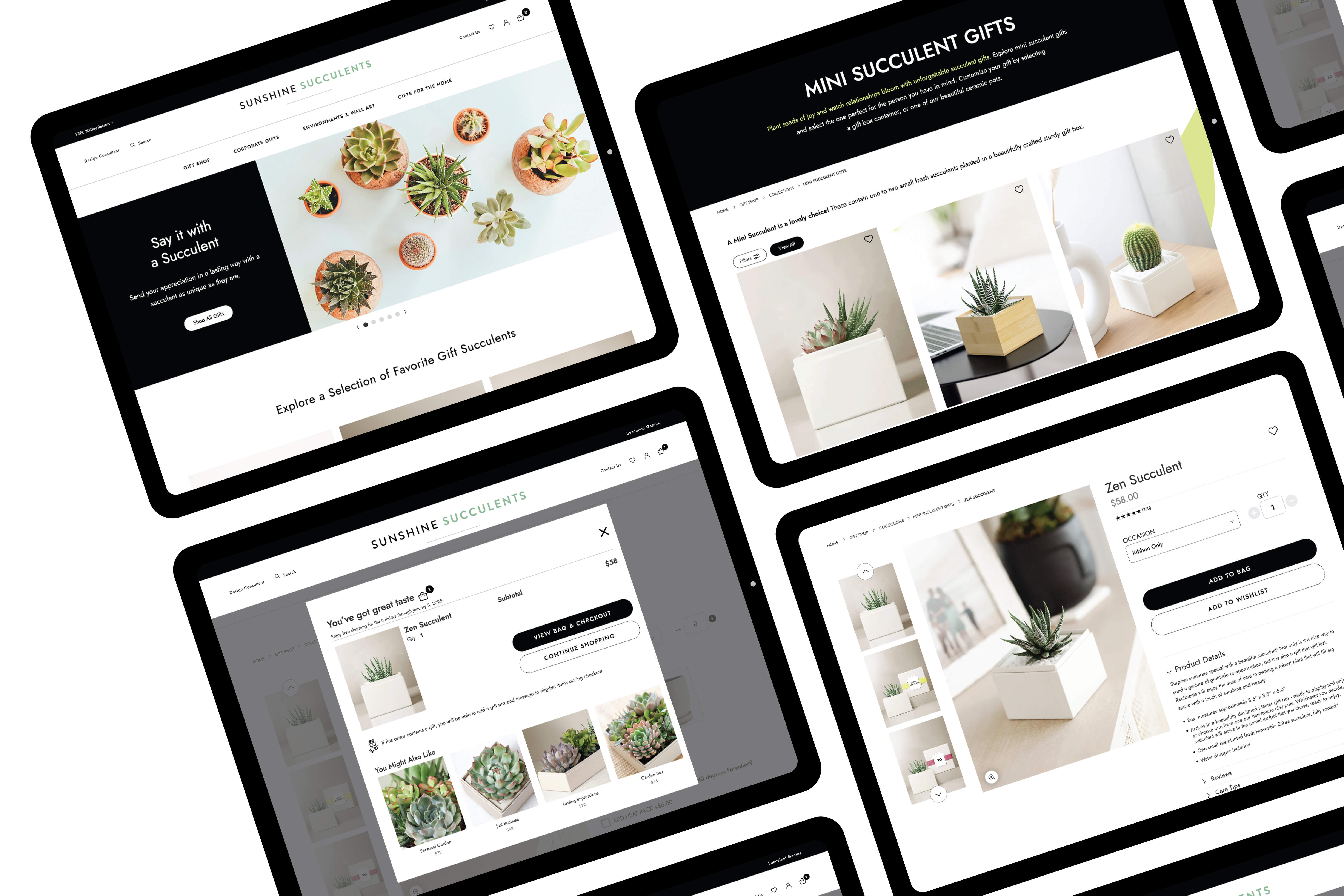
WIREFRAMES AND PROTOTYPE I started with a sketched wireframe and three potential initial interactions. I ended up creating a quick prototype to test these initial first screens with users on both mobile and desktop. Since one critical use case was that of users placing orders on their mobile as they headed out the door to work or on the drive to work, simplicity of the ordering process couldn’t be stressed enough. Another use case was the vacationer looking for the right spot to enjoy a beautiful morning overlooking the coast while sipping coffee and nibbling a pastry. These target users and use cases informed many of the UX principles that I chose to use to effectively design a solution that might test well with users. Hick’s Law and Fitts’s Law were a few of the most effective ones I used in this project.
04. UI
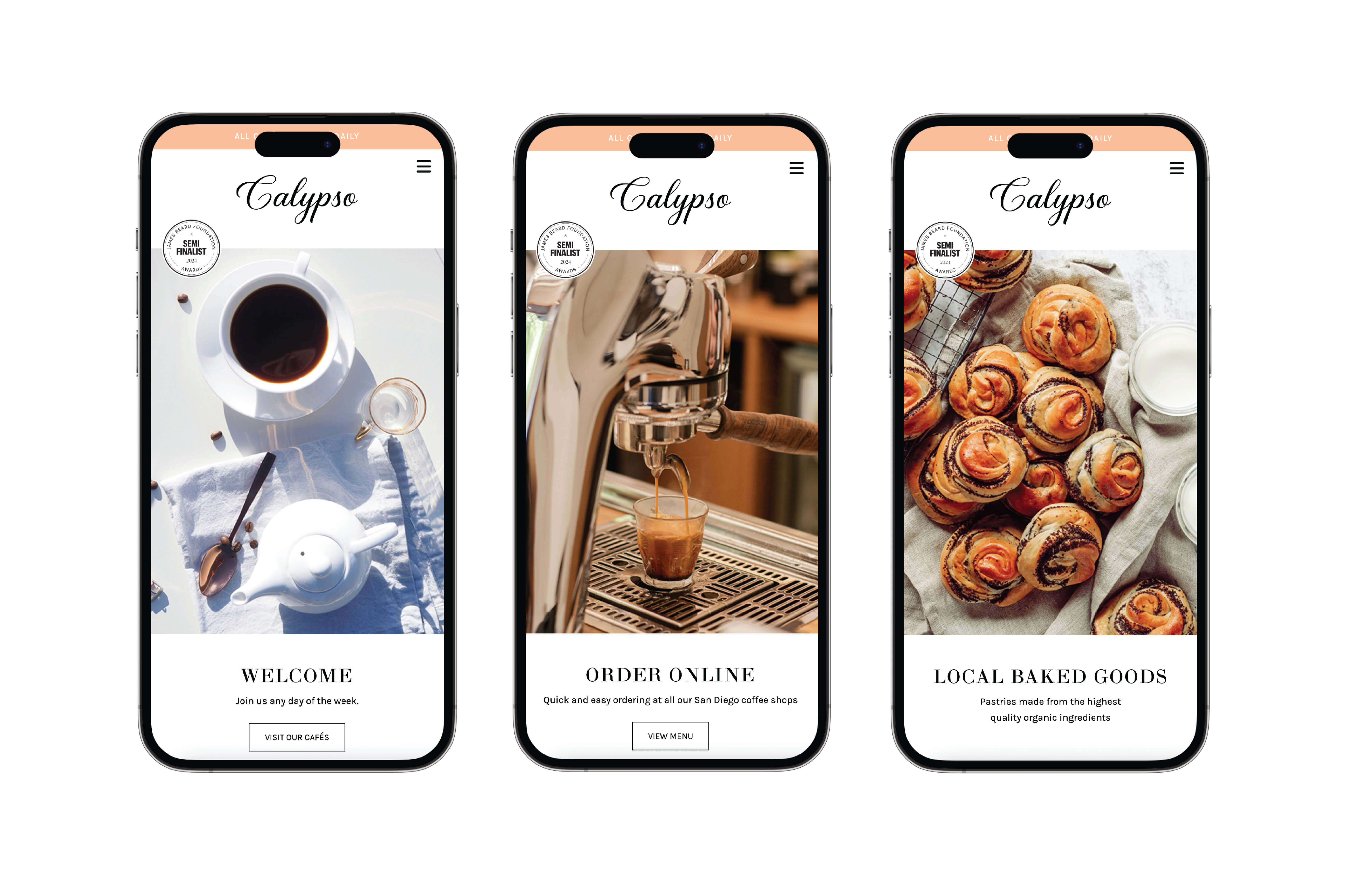
BRANDING I did a brief competitive analysis on similarweb.com and referenced some of my color theory research and these, along with the user feedback, helped me make decisions on branding. Style, and look and feel of the brand, needed to appeal to the luxury vacationer looking for enjoyment, and to the practical local who may also like a bit of panache in a coffee/café choice. An elegant logo wordmark consisting of the font Bela Yasmine was used to inspire these feelings and I chose the name Calypso after the Greek goddess who lived by the sea on the island of Ogygia. Since the concept café was located steps from the ocean with beautiful panoramic views, the name struck me as appropriate. A bit obscure, sea-inspired, and rooted in mythology. A color palette of tangerine orange, creams, and black walked the line between elegance and coastal fresh with notes of tranquility intended to appeal to a male and female demographic.
USER INTERFACE DESIGNS I created UI designs in Figma. I started with mobile first and tested those prototypes and interactions prior to moving on to desktop designs. Large, immersive imagery in the hero was chosen for featuring product, environment. The carousel featured a focus on product, experience, and quality. I did have adjustments to make on CTA and button targets. CTA text and buttons needed to be visible with the image as it was animating from screen to screen.
INTERACTIONS Interactions were created to happen right after onload. Those first three screens offered key options to “View Menu”, “Order Online”, or to explore the site. This was designed to address the need to order quickly and to understand the luxury aspect of the product and experience.
MENU DESIGN I designed two custom menus in Illustrator featuring menu food and drinks. The second menu for drinks helped call out the focus on organic, responsibly-sourced coffee beans, and the array of unique café drink options.
05. Validate
USER TESTING I did two rounds of iterations based on the user testing. The speed of carousels sitewide needed some adjusting. Many users said the animations were too fast, so I adjusted the speed of them on the hero and 'Press' sections. I reduced the 4-column 'Order Online' menu to 3-column on desktop so users could see description text more easily.
06. Development
HTML/CSS/JAVASCRIPT Usually, If I'm doing the UX/UI on a project, I'm not typically developing too, but on this project I did. Following two rounds of user testing and iterative design on prototypes I started development of the site. I coded in HTML, CSS, and JavaScript without using a framework like Bootstrap/Foundation. It was a chance to write semantic HTML, with all styles in CSS, and get more experience adding alt tags throughout for accessibility.
RESPONSIVE LAYOUTS I used a combination of layouts for sections on the homepage using CSS grid for desktop/tablet and Flexbox for mobile. I built mosaic, 4-column, and 3-column sections on desktop and included a parallax. Carousels were integrated for the hero and Press sections.
MOBILE EXPERIENCE For the mobile experience, I designed the burger menu in the upper right corner since my research suggests 87% of mobile users are right handed and use their dominant hand to hold their phone. Upon tap, the mobile navigation right-slide drawer offers navigation options on the right side of the screen near the right thumb. This was implemented to improve the user experience of the mobile site and make placing orders on the go as easy as possible.
BETA SITE Currently the site is functional and initial beta tests suggest the user experience is fine. The online ordering system will be finished soon, and I look forward to understanding opportunities in this part of the project, mainly from a development standpoint.
Outcome
This was an enjoyable exploratory experience but there is always more to learn. I look forward to doing more of that in this next phase.
Lessons Learned
There were many of these! I learned that frameworks are our friend. I enjoyed hand coding this site, especially as semantic HTML relates to quality SEO, however, it does make me appreciate the tools we have that help us start projects with, at minimum, a skeleton. A scaffolding that we can work within to more rapidly produce product. Build tools like Webflow, Framer, and others are also developer tools that can offer faster production and full customization for many projects.
I loved the chance to figure out how to create a burger menu for mobile that animates in from the right, putting menu options within close proximity to a user’s right thumb for ease of use. I also liked designing my first café menu. This is something I hadn’t done before. My favorite part of the project was crafting the mobile experience and initial interaction screens using the participant feedback, then taking that model and designing the desktop experience.
